- Waking up from hibernation
- How does the dashboard work?
- Getting the data for the routes
- Building process in Tableau
- Designing the graphical elements
- Viz afterlife and collaboration with HELVETIQ
Waking up from hibernation
I’ve put myself up to a challenge to shake me up from hibernation: create an interactive dashboard, but do not compromise on the design. Sounds very unlike me. I’d always compromise on the first to make something visually appealing. I also realized why I don’t do tasks like this: because it sucks big time. On the other hand, I have to admit that I enjoyed creating a dashboard where everything is possible, and just a question of how much energy, time, and effort you put into it. A very refreshing experience after being stuck in the reporting world for the past couple of months.
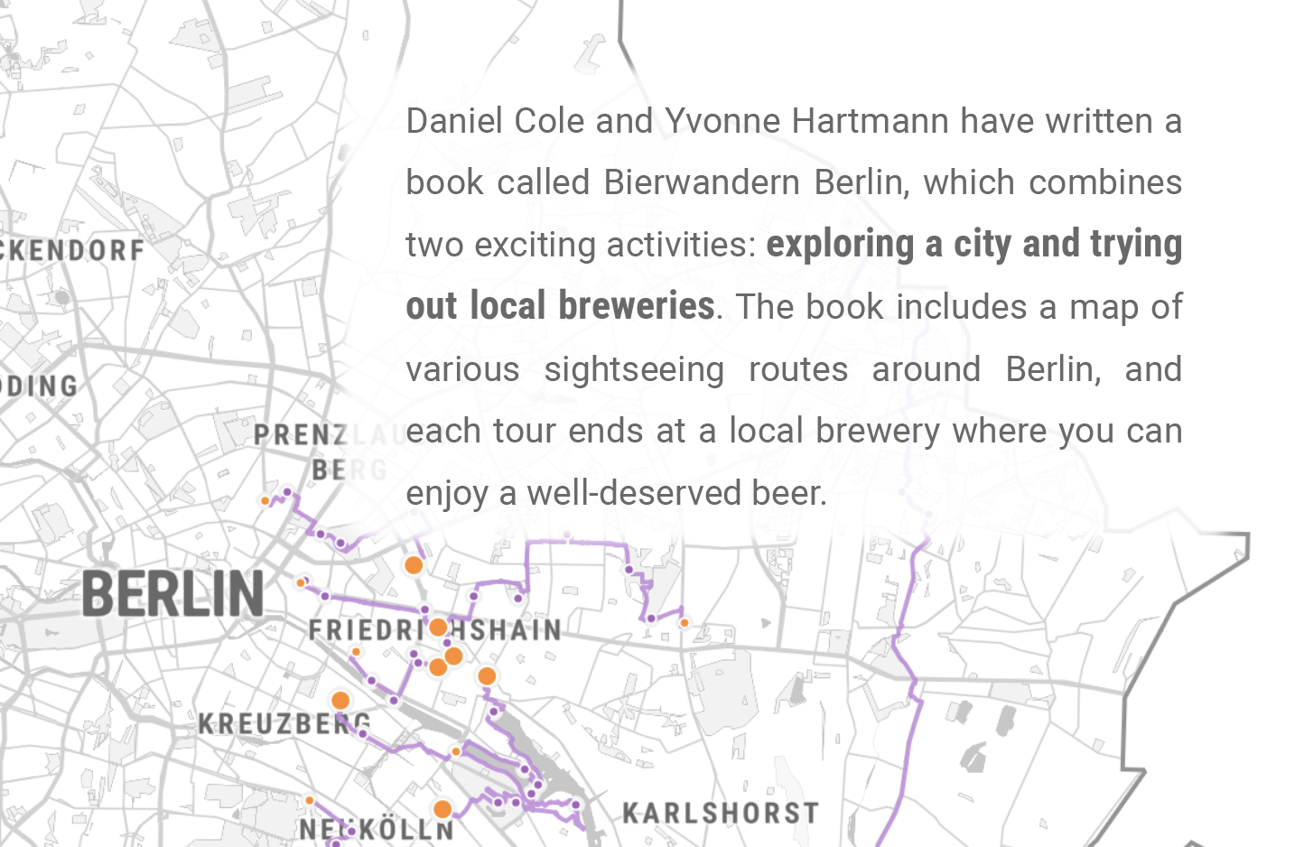
What was the topic that managed to wake me up from this dataviz hibernation? Beer. More precisely, the possibility of biking somewhere and drinking a beer outside in Berlin after we barely saw the sun since November. It was peak winter when I walked into a bookstore to fetch an order when I saw a book called Bierwandern in Berlin (which I translated as Beerhiking on the dashboard) and decided to take it home. Little did I know it has an English edition, so I started reading and translating the relevant parts in my very weak, B1-level German.
Daniel Cole and Yvonne Hartmann – the creative team behind the Hiking and Drinking blog – connected two exciting activities in their book: exploring Berlin and trying out local breweries. They mapped various sightseeing routes around the city that all have at least one thing in common: the last stop is always getting a well-deserved beer. Luckily, the publisher was very supportive of making this visualization come to life. Without their consent, those 100+ hours of work would’ve just gone down the drain.
The dataset I created from the book contains 33 routes to local breweries (I excluded the ones in Brandenburg), with over 250 kilometers of wandering around town, which would take approximately 58 hours to complete. You can choose an excursion that suits you the best since they vary in difficulty and time investment.
Link to the interactive version on Tableau Public

How does the dashboard work?
I won’t bore you with the data collection process since those who know me can imagine how long, painful, and manual it was. Which, I can totally confirm. However, I’ll show you how to get the coordinates of a given route from Google Maps.
Getting the data for the routes
Here’s a step-by-step guide on how to get data on a given route from Google Maps.
- Go to My Maps within Google Maps and create a new one.

2. Add stops to the route and select walking (or any other means of getting by).

3. If you want to alter the route in-between points, just click on the line and drag it to a different direction.
4. Click on the three dots, select Export to KML/KMZ and download.

5. You’ll get a file that can be opened with any text editor, and all the lat-lon coordinates will be in there.

Building process in Tableau
The map
Things I knew I wanted: a clean greyscale map filtered to Berlin. Things I didn’t know I wanted: the hours it would take to achieve this. I started with some templates and created a lot of versions I hated for different reasons. If I’m honest, I hated the one I ended up with as well, until I saw how it would look with data on it. Here are the final contestants:

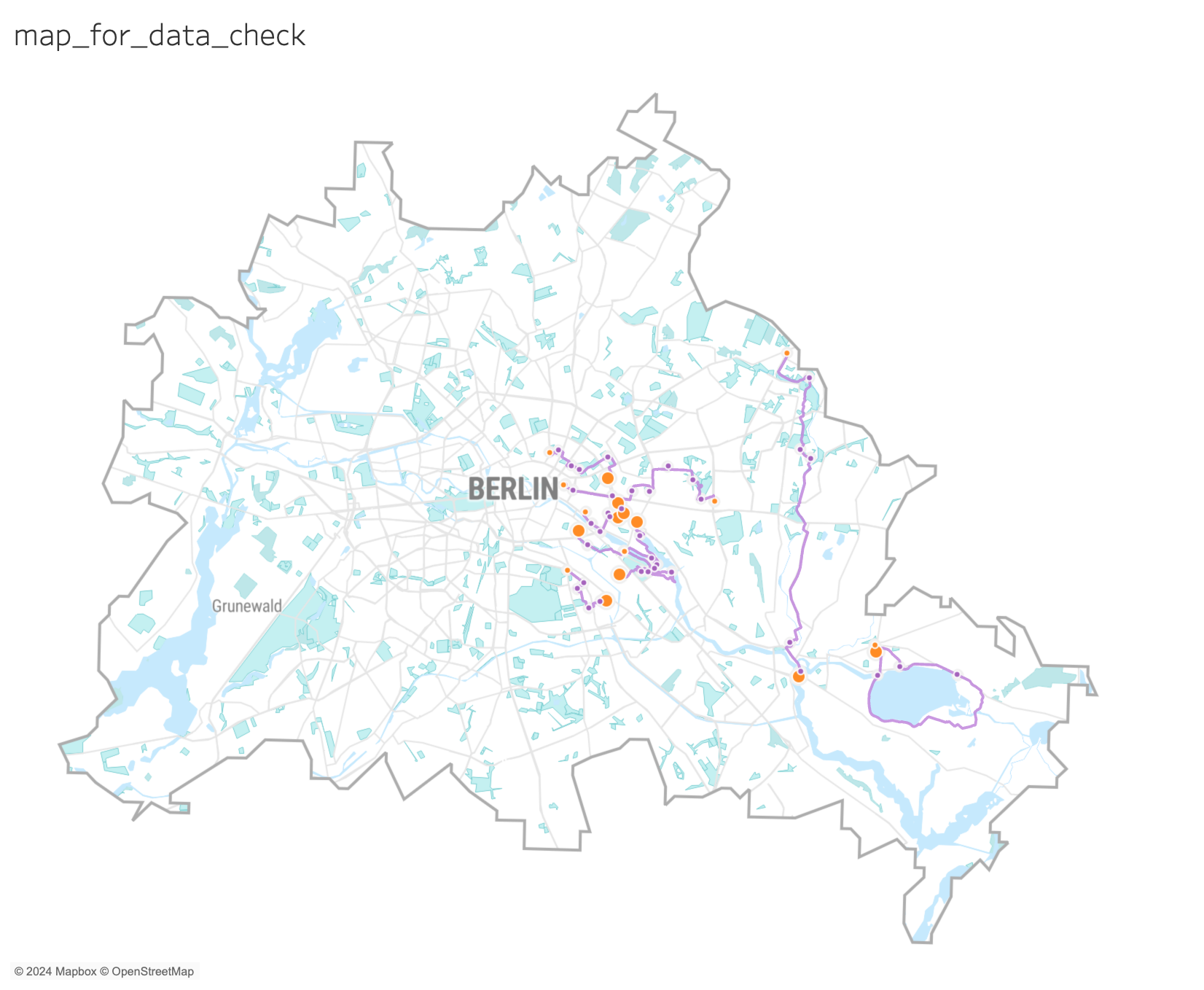

I was aware from the beginning that this visualization would only work if I could eliminate all the unwanted noise and show only Berlin. To filter out the state, I had to find a shapefile in the right file format that I could upload as a custom layer. After hours of careful investigation, I found a detailed geoJSON file of the German states on Github that I could finally upload to Mapbox. Unfortunately, every time I tried to upload, I ran into an error message. It turned out that the new layout for styles uses components, and you have to release all of them (similar to ungrouping) before you add custom layers. Here’s the link to the map if you’re curious how I did it and you’d want a shortcut to filtering.
Map layers
Some people utilized map layers way more than I did here, but I wanted to mention anyway that the routes and the POIs appear on different layers. With this method, I could display multiple information on the same map. I wanted to visualize the hiking trips as a line and show information about the roots in the tooltips, while I aimed to highlight the sightseeing attractions and breweries as points.
One of my favourite examples was built by Thi Ho about Singapore Population, Housing & Infrastructure.
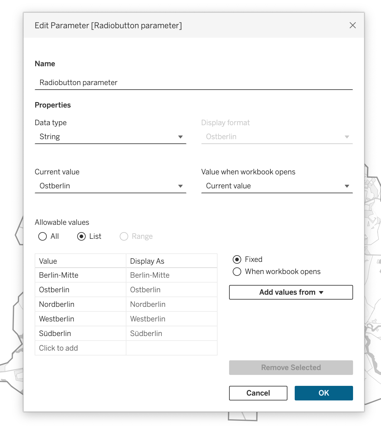
Applying custom radio buttons
We all know that the design of filtering options is not Tableau’s strongest point, and since I said interactivity but no compromises, I had to go for a workaround. For that, I mainly followed the steps of this tutorial. You can download the workbook and check it out yourself – hoping I didn’t leave too much of a mess behind.


1. I designed two buttons, one for the selected item, one for the unselected ones (see on the picture above), and added them as shapes in my Tableau Repository.
2. The next step was creating a parameter for the radio buttons.
3. This was followed by creating two calculations for each area in town: one for latitude, one for longitude. I’ll show Berlin-Mitte here as an example:
Mitte rb lat:
if [Area] = 'Berlin-Mitte' then [Lat] end

Mitte rb lon:
if [Area] = 'Berlin-Mitte' then [Lon] end
4. Then I needed a parameter controlled latitude and longitude value that I could add to the Rows and Columns:
param lat:
case [Radiobutton parameter]
when 'Berlin-Mitte' then [Mitte rb lat]
when 'Ostberlin' then [Ostberlin rb lat]
when 'Nordberlin' then [Nordberlin rb lat]
when 'Westberlin' then [Westberlin rb lat]
when 'Südberlin' then [Südberlin rb lat]
end

param lon:
case [Radiobutton parameter]
when 'Berlin-Mitte' then [Mitte rb lon]
when 'Ostberlin' then [Ostberlin rb lon]
when 'Nordberlin' then [Nordberlin rb lon]
when 'Westberlin' then [Westberlin rb lon]
when 'Südberlin' then [Südberlin rb lon]
end
5. I placed the [Area] field in rows and unchecked the header.
6. I created the following calculation for the shape of the radio button and placed it on the Shape mark. If the selected parameter equals the area, it will have a t in the front, if false, an f. You have to repeat the formatting for all options to return the right shape.
shape rb:
str([Radiobutton parameter]=[Area])+[Area]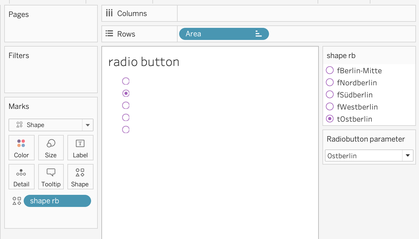
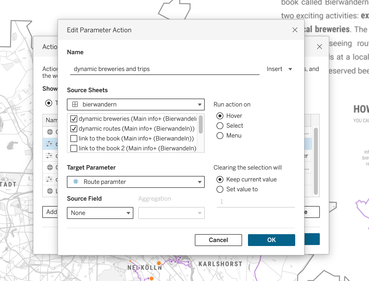
7. The last thing to do is to configure the parameter action after adding it to the dashboard.

Using images as background maps
…and hours of extra work because of web-safe fonts. I’ve written a blog post about this issue a few years back, but there have been no improvements so far. In a nutshell: only a bunch of fonts will render the same on any browser as on your local machine. Tableau claims that Roboto is one of them, but if you try it out, you’ll see that it’s not the case (at least on Safari). Since I used Roboto Condensed for the map, I didn’t want to use anything else on the dashboard.
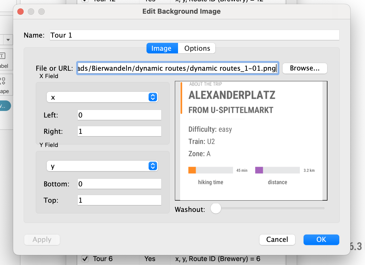
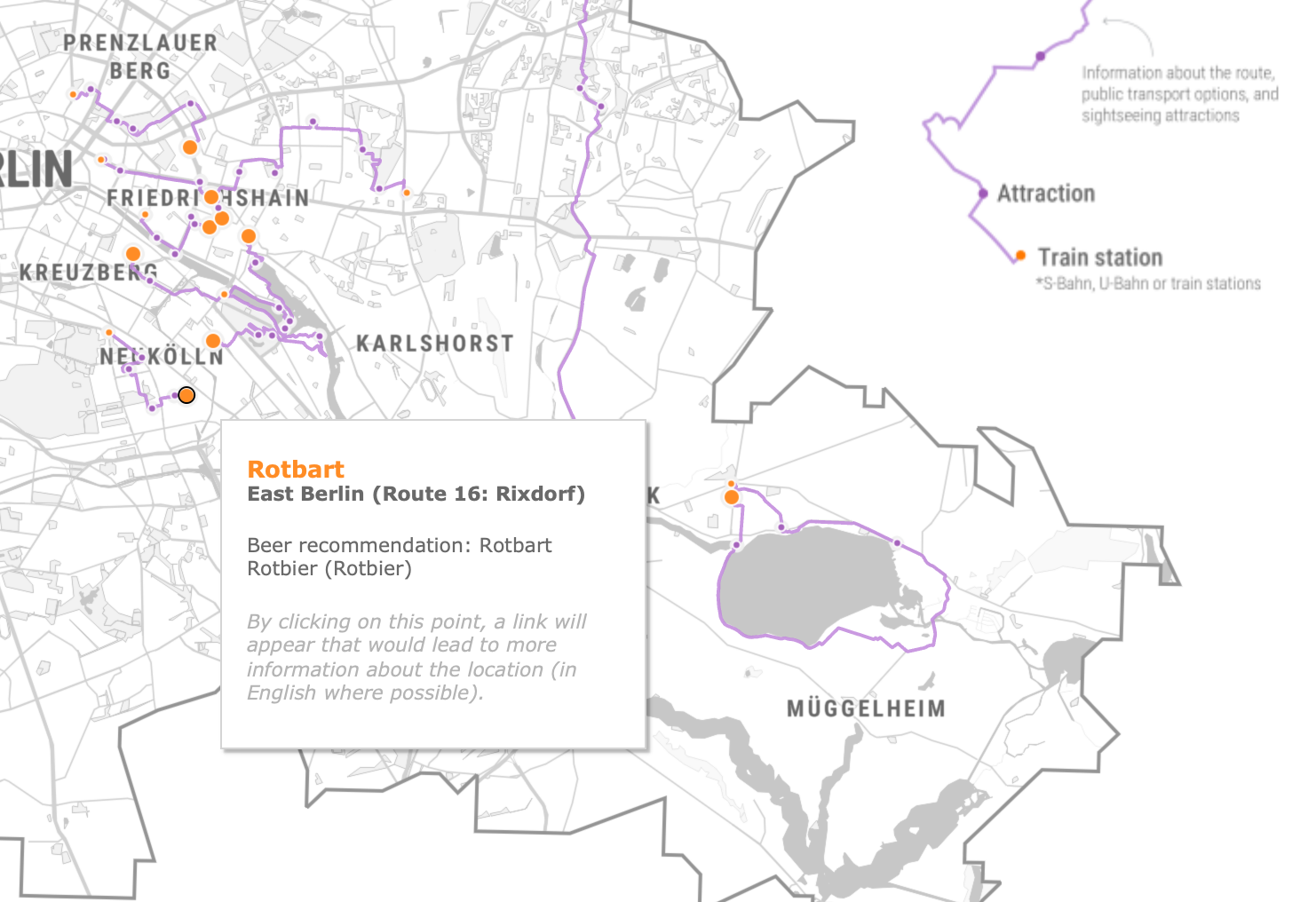
What does it mean in practice? I had to create 33 pictures for the trip info and 33 for the beer recommendation to use as parameter-controlled dynamic images. All these pics were uploaded to Tableau as map background images to achieve the final result (see the video above). I chose to include them as files, but there’s another option to link them as publicly hosted images.

For the pseudo map, I created three calculations. There’s a dummy for x and y values to put in Columns and Rows (they both have a value of 1). A boolean calculation that returns true when the Route parameter equals the Route ID is placed on the Filters shelf. The next step was to fix the axes of the x and y values from 0 to 1 and hide them from the view. Then navigate to the Map / Background images menu and add a new background image. Don’t forget to state the left, right, top, and bottom positions as seen in the below picture. After setting these, go to options and tick both image options: Lock Aspect Ratio, Always Show Entire Image. The last thing to do is to set the filter criteria and repeat the same process for all other images.

When added to the dashboard, you need to configure the parameter action to change the images based on where you move over the map. It’s done using the same method mentioned in the radio button part, but to complete this section, here’s how I configured the dashboard parameter action:
Custom tooltips
I already have a blog post dedicated to smarter tooltips, so I used the same tricks here to achieve a better UI experience. Just as radio buttons, tooltips are not the most beautifully designed elements of Tableau. Let me show what I mean. This is how a tooltip would’ve looked like without using a workaround:


With this built-in solution, there’s no way to control the size of those tooltips, which might flow over some important information. What I did instead is to create the labels as viz-in tooltips, which allows for sizing. By adding the text as a standalone viz and embedding it as a tooltip, you’ll have this code that you can tailor even further:
<Sheet name="route viz-in tooltip" maxwidth="300" maxheight="300" filter="<All Fields>">After trying out a few options for maximum width and height, these were the tooltips I decided to use versus the ones above:

Designing the graphical elements
Color choice
First, I had the idea to go pastel, but if I wanted to configure a map with street-level info, the data I wanted to highlight would get lost in all the noise. After deciding on a greyscale map, I took a U-turn and chose the most vivid colors I could imagine. On the purple, I settled fast, and even though I’m not the biggest fan of orange, the two are complementary colors and go well together. I used purple as a baseline on the map and orange as a highlight.
Designing the elements on top of the map
I wanted to have a default view of the map but still let people zoom into different areas if they like to. That meant that some of the graphical elements should float on top, and when zoomed in, they need to provide some opacity but not be confusing. The first idea was to have a white outline behind the letters, but in the end, I went with my brother’s suggestion: a box with 90% opacity and 10px Gaussian blur. I would’ve been happy with the first option as well, but it seemed a bit noisy compared to the final solution.

Viz afterlife and collaboration with HELVETIQ
It’s always crucial to reach out to the people who have intellectual rights on the project you started working on. And maybe try not to be like me and wait until you’re knee-deep in the visualization process. I was lucky to have permission from both the publisher and the authors to reveal this much information about the book. As a cherry on top, I got PDF versions of another two: Beer Hiking Southern California and an upcoming book on wine tours in Germany from the same writers (Daniel Cole and Yvonne Hartmann).
Who knows, there might be a similar viz about a similar topic in the future! 🤐
