It’s no secret that I’m a walking love letter to Budapest, but I can’t stop being obsessed with it. A couple of weeks ago, I created a visualization of my favorite places in the hood – I was just too lazy to write the blog post about it. Since Steven Shoemaker dared me to make a map, I’m starting to get the hang of it. Read on if you want to know the inspiration behind the viz or how to make it yourself. Otherwise, you can have a look at all my iconic locations on Tableau Public.

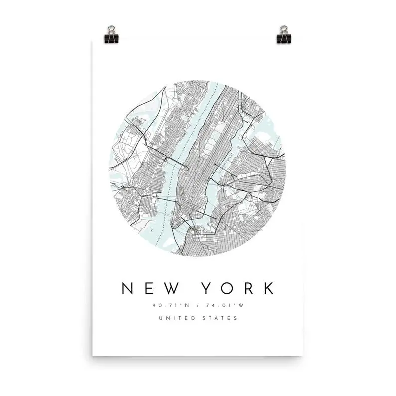
I saw some beautiful map prints on Etsy, and I wanted to recreate a similar look myself in Mapbox Studio. I started out from a Monochrome template and adjusted the layers and components to remove all labels and change the colors to different shades of this pastel blue. I have to admit that Mapbox is quite hard to get sometimes, and it doesn’t work the same way as I would think it will. But once you’re used to it and created a couple of your own templates, you just have to copy and tweak them a little, and it saves a lot of time. I also like how they made it so easy to add the styles to your Tableau workbook. If you haven’t done this before, check out this great tutorial on how to integrate it.


After I finished styling my map, the next step was collecting the data. Maybe I’m the last person on Earth who discovered this, but did you know that if you right-click on any points on Google Maps, it will give you the coordinates? If the answer is no, have a look below. This is magic!

The next obstacle was making my map round-shaped. I know I’d need to use layers to do that, and not just because I’m obsessed with layers in Tableau, but there’s really no other way. The first step was making an image in Illustrator that has a “hole” in the middle. When you put this image onto your canvas, it looks like just what you’re aiming for, but there’s this one big disadvantage. The map loses interactivity because of the see-through image you placed over it.

To achieve the interactivity, I had to duplicate the map, change the opacity of the mark to 0% and remove the background image of the 2nd map and place it over the original one. This was a very time-consuming activity, but CJ Mayes discovered a better way to do that. It turns out it’s enough to washout the map entirely and then remove the background color. If you’re considering making a cut-to-shape map, be smart like CJ, and don’t waste an hour of adjusting the axes like me. However, here’s my suboptimal solution posted on Twitter if you don’t like the easy way out.
Comments